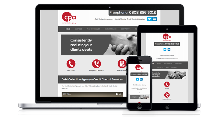
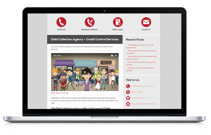
The Cash Protection Agency design brief was to redevelop the site from static HTML/CSS WordPress to a mobile responsive WordPress layout.
User experience, load time and the multiple viewports (desktop PC, laptop PC, tablet and smartphone) are essential aspects of a mobile site.
Because a mobile site needs to perform well on devices with smaller screens and less computing power, a fundamental rethink about what is and what is not needed is always essential.
Taking the less is more mindset into account when designing for mobile is important because a “thirsty” website can gobble up a user’s data allowance, besides possibly causing them to leave the site altogether.
The branding design of the site was to remain intact, as explained by Tim – the representative liaising on behalf of the CPA – and the existing onpage SEO needed to remain too.
Planning the Improvements
The first step was to create an audit of the website before the converting it to its new and improved form. This was an opportunity to assess and highlight areas of improvement as well as estimating the cost.
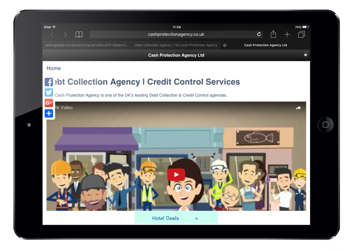
A free plugin called “Wizziapp” had been used in the original site to give a pseudo mobile experience.
The plugin created a tablet viewport experience that was barely acceptable because it did not display the front page and instead just presented the WordPress newsfeed with third party adverts for hotels:
You can watch the video below to see what the site had looked like in its former state on a desktop PC:
Redeveloping the Site
The main aspects of the redevelopment involved minimising the size of the database, reducing the number of plugins, adding a caching service, setting up a new custom theme and changing some of the graphics from raster to vector.
Other tweaks and changes were made as well and these are covered in the video at the end of this page.
Permalinks
One of the first issues I notice about the original site was that all the permalinks used a .html suffix, which is unusual for a WordPress site.
This was a separate challenge from the mobilisation of the site but I felt it was important that we use “naked” URLs instead of the .html extensions.
It transpired a plugin had been used to achieve this, so this was disabled.
The permalinks now looked like this:
However, part of the criteria in the design brief was to preserve on page website SEO.
Because the .html suffix had been disabled, the site now needed to be configured to make sure any legacy backlinks pointing to the old versions of the permalink would forward to the new “naked” permalinks.
Without this crucial step, anyone visiting older links – perhaps posted on social media sites – would get a 404 not found error report.
Forwarding any old links to the new links was done using a 301 redirect rewrite inside the .htaccess file:
Improving Graphics for the Mobile Experience
The old version of the site was using raster images for the logos and buttons, which are poorer in quality and larger in file size.
Because a mobile website uses different screen widths depending on what device it is viewed, certain elements, including logos may need to be resized.
Raster images do not scale up well as you can see in the screenshot below.
Blurred, stretched pixels are a common problem in both design and print, and is the reason vector paths are preferred:

Raster graphics don’t scale well and have a larger file size
By comparison, vector graphics can be resized using CSS for different mobile viewports. Vectors scale up or down without any issue show details very well.
These types of graphics would always have crisp, defined edges and that is why they suit mobile websites so well.
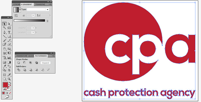
Vector paths are designed to scale up or down
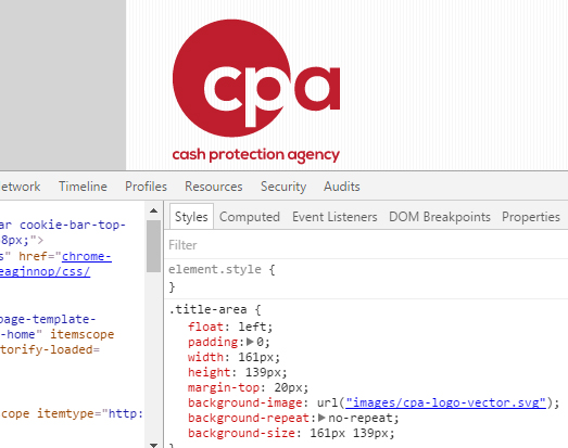
The CPA were able to send a version of their logo in a vector format, and this was added in to the website header as an SVG (scalable vector graphics).
The screenshot shows how the SVG logo has been called in the CSS.
This is so that all view ports (desktop PC, laptop PC, tablet, smartphone) can just reiterate the CSS with different dimensions if required.
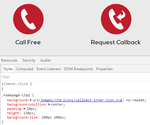
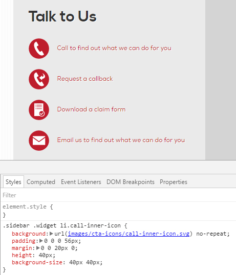
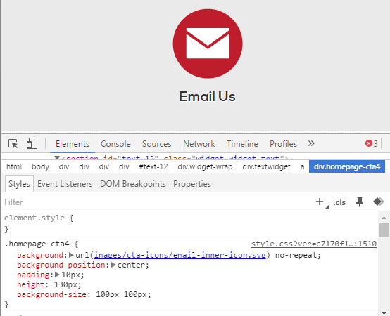
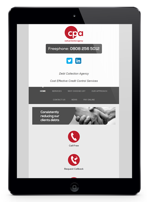
The same principle of using CSS with vector graphics was applied to the red circular call to action buttons on the website homepage as well as the sidebars.
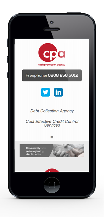
In mobile view the areas containing the SVG icons collapse into a vertical column and are slightly resized using different CSS:
Added Security
Security plugins including WordFence and iThemes Security were also added.
These are tried and tested plugins with a great reputation and well worth adding to any WordPress website.
CloudFlare was also set up not only to provide an additional layer of security, but to act as a content delivery network for speeding up the load time of each webpage. This is a caching service for websites working in a similar way to your web browser caching.
Completed Website Overview
Much of the redevelopment is discussed in the following video case study:
