This is the stage where overall look, feel and layout is established, with user-friendliness, fonts, colours, usability standards, quick load times and accessibility for all.
Based in Ilkeston, Derbyshire, and serving the Nottingham and Derby area, I provide website services, including development, for small to medium businesses.
As soon as a visitor arrives on your website, they need to quickly “get” what you’re about. This is something you and I will discuss, possibly looking at other examples of similar websites.
Don’t be too in love with your own ideas though. You’re meant to serve the target market, not your own tastes.
The ideal customer needs to find this website both appealing and easy to use.
The site needs to load reasonably quickly. Think about people using a mobile phone on bad wi-fi.
1. Overall Look and Feel
Visual communication is just as important as written communication, and that’s why brevity is important.
- We should not overload the site with fancy bits, pieces, gadgets or distractions
- The design will be simple and “flat”

2. Choosing Fonts
Two fonts maximum. Any more than that and it starts to look messy.
- Ideally, one font will be serif (the curly decorations, like these).
- The other font would be sans-serif (no decorations).
Titles and headings will be used by one font, and the body text will be used by the other. Simple.
3. Colour Scheme Research
The colour palette you choose affects communication, user experience and purchase decisions so it’s important to spend some time thinking about it.
Colour schemes in websites follow some simple rules:
- Don’t use light colours on light backgrounds.
- Avoid using colours that are close together on the colour spectrum (with exceptions)
- Use colours that are already in your existing marketing materials
- Use one strong, specific colour for anything that is supposed to be clicked (an action colour)
Red means “stop” and green means “go.” Traffic lights send this universal message. Likewise, the colours used for a product, on a website, business card, or logo send certain messages.
Examples:
RED
Positive: Warmth, love, boldness, excitement, speed, strength, energy, determination, desire, passion, courage, socialism
Negative: Anger, danger, restriction
PINK
Positive: Feminine, love, caring, nurture, friendship
Negative: Immaturity
ORANGE
Positive: Cheerfulness, affordability, enthusiasm, stimulation, creativity, food, liberal
Negative: Warning, facetious, unintelligent
YELLOW
Positive: Attention-grabbing, comfort, liveliness, optimism, overwhelm, summer, comfort, liveliness, intellect, happiness, energy
Negative: Cowardice, hunger, conflict
GREEN
Positive: Durability, reliability, environmental, luxurious, optimism, well-being, nature, calm, relaxation, Spring, safety, honesty, optimism, harmony, freshness
Negative: Envy, illness
BLUE
Positive: Peace, professionalism, loyalty, reliability, honor, trust, coldness, depth, stability, professionalism
Negative: Melancholy, boredom
PURPLE
Positive: Power, royalty, nobility, elegance, sophistication, luxury, mystery, royalty, elegance, magic
Negative: Artificial, pompous, conceit, mourning
GRAY
Positive: Conservatism, traditionalism, intelligence, serious
Negative: Dull, uninteresting
BROWN
Positive: Relaxing, confident, casual, reassuring, nature, earthy, solid, reliable, genuine, endurance
Negative: Dirty, dull, humourless
BLACK
Positive: Elegance, sophistication, formality, power, strength
Negative: Illegality, death, depression, morbidity, night
WHITE
Positive: Cleanliness, purity, newness, virginity, peace, innocence, simplicity
Negative: Sterility, cold, isolating, boring
We might look at a colour wheel, which shows opposites on the spectrum.
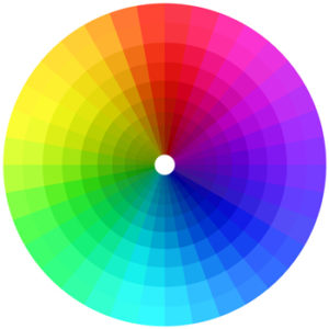
For example, black and white are opposites, create boldness and work well together.
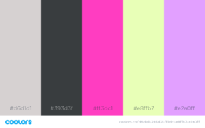
Use an online colour scheme generator like Coolors.co.
4. Standards and Templates (Usability, Accessibility, etc.)
If we use WordPress, it will be based on a template design that is customised, programmed and coded by me.
This is called a theme and can be changed to another theme if needed.
The advantage to using a theme is that you only have to add a new page or post, insert the content and click publish.
Consistency is key:
- All pages and posts will all have the same look and feel
- The website will be uniform in appearance at all times
Usability
Visitors must be able to navigate your website easily which means eliminating question marks in the minds of the users.
Here’s a good definition of usability:
A person of average (or even below average) ability and experience needs to be able to figure out how to use a thing to accomplish something without it being more trouble than it’s worth.
Accessibility
Users with disabilities are supposed to be able to access and use your website without problems, just as wheelchair ramps and lifts are supposed to be installed in public spaces, amenities, buildings etc.
Accessibility for websites involves, among other things, making sure blind or partially-sighted users can operate the site. These people tend to use screen readers, which is a piece of software that reads text aloud.
Images must be labelled in such a way that screen-readers can say, for example, “Picture of cat crouching in the grass.”
5. Basic Layout Creation
I’ll create a basic website layout using the criteria discussed and agreed. This will be done in HTML, PHP, CSS and Javascript.
You’ll be presented with one or two pages in the form of a 2-3 minute private YouTube video.
If you’re curious to know about website programming languages:
- HTML is about the structure
- PHP is for sending data
- CSS is about the colours
- Javascript is for interactions, animations and moving parts
6. Validate Mockup
With further discussion, addition, subtraction, trial and error we’ll tweak and revise the layout.
A private YouTube demo video will be emailed to you. A private version of the site will be uploaded for you to look at too.
We’ll settle on a version of the layout that will be suitable for your website visitors although some of this is likely to evolve throughout the rest of the project, which is normal.
New Website Guide
Menu
- ⚖️ Quote Submission
- 🗃️ Preparation
- ♟️ Planning
- 📰 Layout
- 🖇️ Content Preparation
- 🧩 Content Integration
- 📐 Design
- 🪛 Technical and Usability
- ⚙️ Putting It Online